Dynamics of Remnant Structures Produced by Mergers between Identical Anisotropic Spherical Galaxies
This study compares the remnants of mergers between radially-anisotropic spherical galaxies with their isotropic look-alikes. Utilizing N-body simulations with varying degrees of initial anisotropy, we analyze the resulting relaxed remnants to assess differences in their shapes and density profiles. Our analysis focuses on how the faster merger rates observed in anisotropic models influence the transfer of angular momentum during the collision process. By comparing these dynamics, this research aims to display the impact of anisotropy on the equilibrium states of the remnant structures of these merged galaxies.
Provided below is an example of the analysis we do where we have two functions that work together in plotting the “averaged” axial ratios (c/a and b/a) over time for both the anisotropic and isotropic data sets.
def compute_and_plot_caba_time_series_average(idpat='[cdef]', idd=['10', '13'], labels=['Isotropic', 'Anisotropic'],
                                        colors=['blue', 'orange'], compare_time_title='Averaged Axial Ratios Over Time',
                                        shell_number=4):
    """
    Computes and plots the averaged axial ratios (c/a and b/a) over time for each realization.

    Parameters:
    - idpat: str, file pattern for identifying datasets of the same type (e.g., '[cdef]').
    - idd: list, identifiers for different realizations (e.g., ['10', '13']).
    - labels: list, labels for each realization in the plot.
    - colors: list, colors for each realization in the plot.
    - compare_time_title: str, title of the plot.
    - shell_number: int, specific shell to analyze.
    """

    for i, realization in enumerate(idd):
        color = colors[i % len(colors)]
        label = labels[i]  # Label for each realization

        # Construct file name pattern
        name_pattern = f'r{realization}{idpat}_shape.txt'

        # Initialize dictionary to accumulate axial ratio data by time
        time_dict = {}

        # Load and process data from matching files
        for name in glob.glob(name_pattern):
            # Load data from file
            data = np.loadtxt(name, unpack=True)
            time, n, r_rms, ca, ba, r_off, x1, y1, z1, x2, y2, z2, x3, y3, z3 = data

            # Filter data for the specified shell
            mask = (n == shell_number)
            time_filtered = time[mask]
            ca_filtered = ca[mask]
            ba_filtered = ba[mask]

            # Accumulate c/a and b/a values by time
            for t, ca_val, ba_val in zip(time_filtered, ca_filtered, ba_filtered):
                if t not in time_dict:
                    time_dict[t] = {'ca': [], 'ba': []}
                time_dict[t]['ca'].append(ca_val)
                time_dict[t]['ba'].append(ba_val)

        # Compute mean and standard deviation for each time point
        times = sorted(time_dict.keys())
        ca_means = [np.mean(time_dict[t]['ca']) for t in times]
        ca_stds = [np.std(time_dict[t]['ca']) for t in times]
        ba_means = [np.mean(time_dict[t]['ba']) for t in times]
        ba_stds = [np.std(time_dict[t]['ba']) for t in times]

        # Plot c/a with a solid line and error bands
        plt.plot(times, ca_means, linestyle='-', color=color, label=f'{label} c/a')
        plt.fill_between(times, np.array(ca_means) - np.array(ca_stds), np.array(ca_means) + np.array(ca_stds),
                         color=color, alpha=0.2)

        # Plot b/a with a dashed line and error bands
        plt.plot(times, ba_means, linestyle='--', color=color, label=f'{label} b/a')
        plt.fill_between(times, np.array(ba_means) - np.array(ba_stds), np.array(ba_means) + np.array(ba_stds),
                         color=color, alpha=0.2)

    # Set plot labels and title
    plt.xlabel('Time of Simulation')
    plt.ylabel('Axial Ratios (c/a and b/a)')
    plt.title(compare_time_title, fontsize=12)
    plt.legend()
    plt.tight_layout()


def plot_multiple_caba_time_series_average(shell_number=4):
    """
    Plots multiple Averaged Axial Ratios (c/a and b/a) time series plots (all three different 'r***' sets for our case) at once
    for any shell number you want (this uses the 'compute_and_plot_caba_time_series_average' function).

    Parameters:
    - shell_number: int, specific shell to analyze.
    """

    # Define consistent axis limits for all subplots
    y_limits = (0.65, 1.0)  # Adjust these based on the range of your data

    # Setup figure for side-by-side subplots
    plt.figure(figsize=(18, 6))  # Wide layout for side-by-side plots

    # Titles for each subplot
    titles = [
        f'Averaged Axial Ratios for r10* and r13* Shell {shell_number}',
        f'Averaged Axial Ratios for r20* and r23* Shell {shell_number}',
        f'Averaged Axial Ratios for r40* and r43* Shell {shell_number}'
    ]

    # Dataset identifiers and patterns
    idd_pairs = [['10', '13'], ['20', '23'], ['40', '43']]
    idpats = ['[cdef]', '[89ab]', '[4567]']

    # Loop through each dataset and create subplots dynamically
    for i in range(3):
        plt.subplot(1, 3, i + 1)

        # Call function for each dataset pair
        compute_and_plot_caba_time_series_average(
            idpat=idpats[i],
            idd=idd_pairs[i],
            compare_time_title=titles[i],
            shell_number=shell_number
        )

        plt.ylim(y_limits)  # Set consistent y-axis limits
        plt.xlabel('Time')
        if i == 0:
            plt.ylabel('Axial Ratios (c/a and b/a)')

    # Adjust layout to prevent overlapping of labels and titles
    plt.tight_layout()
    plt.show()


# Usage of plotting the caba vs time series functions:
# r_3_caba_time = plot_multiple_caba_time_series_average(shell_number=3)
# r_4_caba_time = plot_multiple_caba_time_series_average(shell_number=4)
# r_5_caba_time = plot_multiple_caba_time_series_average(shell_number=5)
Here is a figure of one run from these two functions:
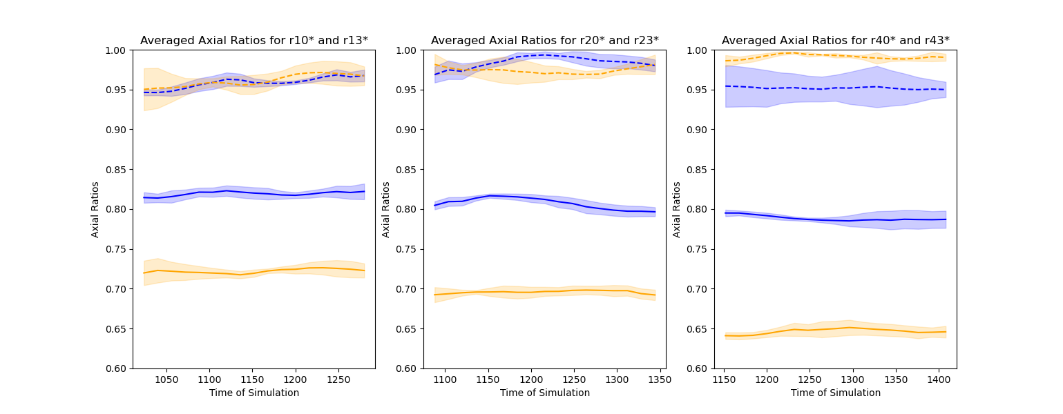
Figure 1: Three graphs of the time series for averaging the axial ratios of b/a and c/a for each realization set (isotropic and anisotropic) of pericentric separation of the initial orbit. The shell of the Merger Remnant that is being represented here is shell n=4. The color blue would represent the isotropic realization merger set and yellow would represent its anisotropic counterparts. The dashed lines would represent the b/a ratios and the solid lines would represent the c/a ratios. Note each graph having different time ranges, whereas the pericentric separation gets larger (i.e., r10 has a smaller pericentric separation than r40), the further down in time we are at. Looking at each graph, we can see that equilibrium is reached for both the isotropic and anisotropic sets as the ratios do not seem to change as time progresses in this time range. In addition, the c/a ratios become lower throughout as the pericentric separation becomes larger, meaning that the shape of our shell becomes more elongated in this trend.